Path@Penn Redesign

PROJECT SNAPSHOT


Redesigning Penn Path for a More Transparent Course Registration Experience

Penn Path is the University of Pennsylvania's academic planning and course registration platform used by thousands of students each semester. Despite its importance, students often struggle with information overload, limited course discovery, and unclear registration workflows.

I redesigned Penn Path's course registration experience by simplifying navigation, improving course transparency, and making enrollment status easier to understand through a clearer information architecture.

Product Solution

01 — Simplified Dashboard Interface

  • Reduced visual clutter and reorganized navigation

  • Added course capacity indicators for faster decision-making

  • Simplified filters to improve course discovery

02 — Optimized Course Information

  • Prioritized key details like schedule, location, and instructor

  • Surfaced permission requirements earlier

  • Moved secondary content into expandable sections

03 — Registration Cart with Calendar Preview

  • Added real-time schedule conflict detection

  • Visualized selected courses in a calendar view

  • Reduced back-and-forth between planning tools

04 — Permission Tracker

  • Visualized the approval process step-by-step

  • Clarified next actions and expected timelines

Path@Penn Redesign

PROJECT Overview


Redesigning Penn Path for a More Transparent Course Registration Experience

Penn Path is the University of Pennsylvania's academic planning and course registration platform used by thousands of students each semester. Despite its importance, students often struggle with information overload, limited course discovery, and unclear registration workflows.

I redesigned Penn Path's course registration experience by simplifying navigation, improving course transparency, and making enrollment status easier to understand through a clearer information architecture.

Product Solution

01 — Simplified Dashboard Interface

  • Reduced visual clutter and reorganized navigation

  • Added course capacity indicators for faster decision-making

  • Simplified filters to improve course discovery

  • Reduced visual clutter and reorganized navigation

  • Added course capacity indicators for faster decision-making

  • Simplified filters to improve course discovery

02 — Optimized Course Information

  • Prioritized key details like schedule, location, and instructor

  • Surfaced permission requirements earlier

  • Moved secondary content into expandable sections

  • Prioritized key details like schedule, location, and instructor

  • Surfaced permission requirements earlier

  • Moved secondary content into expandable sections

03 — Registration Cart with Calendar Preview

  • Added real-time schedule conflict detection

  • Visualized selected courses in a calendar view

  • Reduced back-and-forth between planning tools

  • Added real-time schedule conflict detection

  • Visualized selected courses in a calendar view

  • Reduced back-and-forth between planning tools

04 — Permission Tracker

  • Visualized the approval process step-by-step

  • Clarified next actions and expected timelines

  • Visualized the approval process step-by-step

  • Clarified next actions and expected timelines

my Most memorable things

How might we redesign the course registration experience to simplify navigation, support flexible course discovery, and make enrollment status easier to understand?

One of the most rewarding aspects of this project was redesigning a system I personally use as a Penn student. Experiencing the frustrations firsthand made it easier to empathize with users and identify overlooked pain points.

design IMPACT

my memorable things for this project

How might we redesign the course registration experience to simplify navigation, support flexible course discovery, and make enrollment status easier to understand?

One of the most rewarding aspects of this project was redesigning a system I personally use as a Penn student. Experiencing the frustrations firsthand made it easier to empathize with users and identify overlooked pain points.

Timeline

2025.9-2025.10

ROLES

Product Designer

teams

Solo Project

tools

Figma, Maze

Design Process

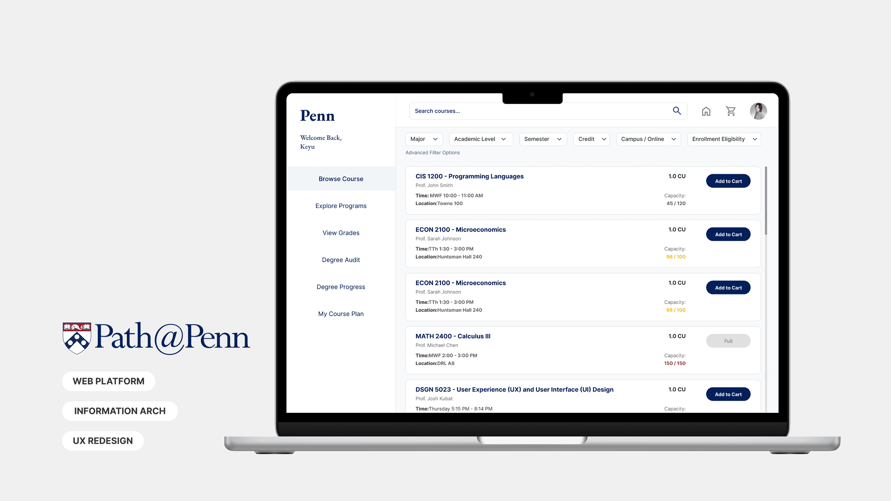
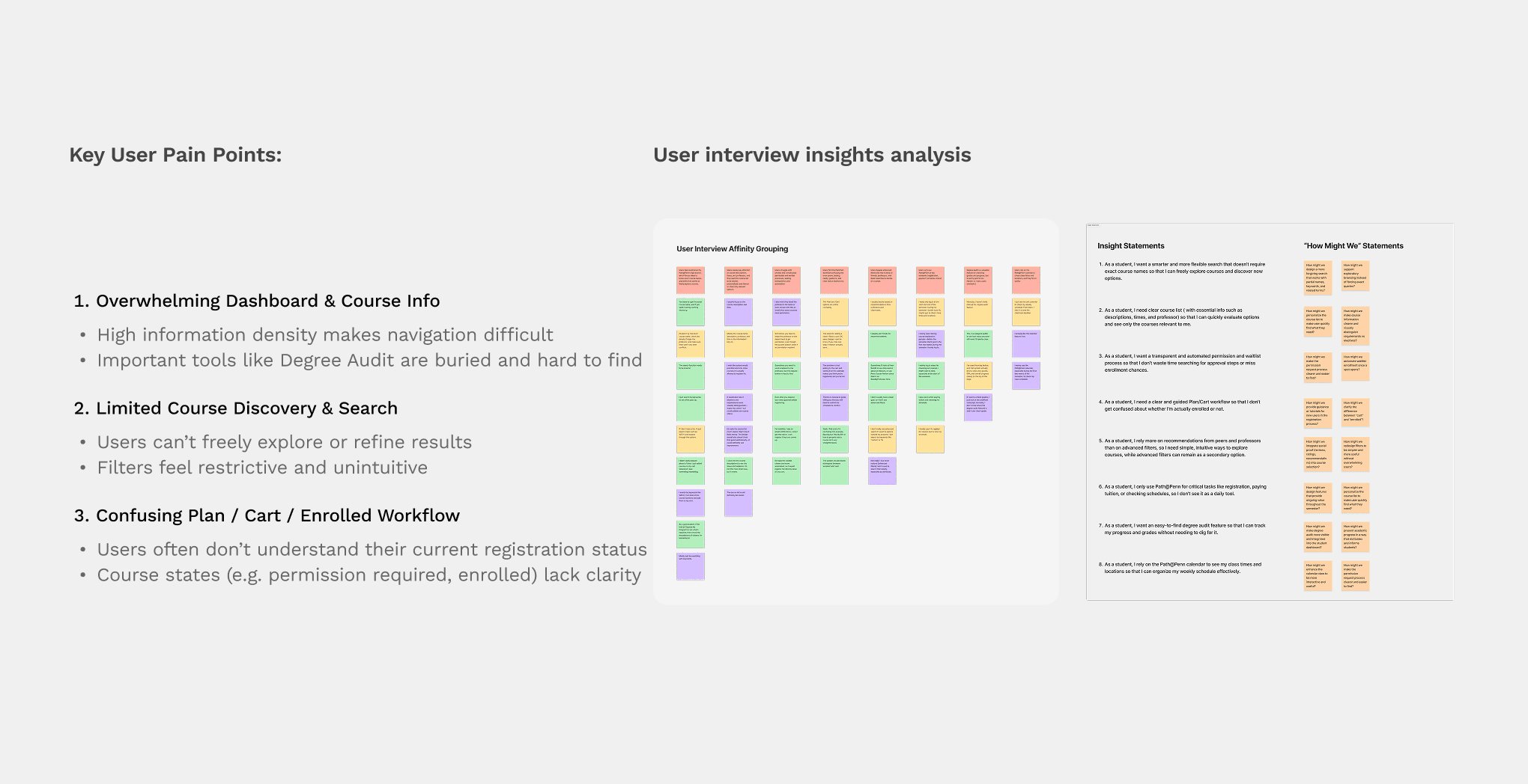
Understanding Why Students Struggle to Register for Courses

User Research

Affinity Mapping

Problem Framing

Conducted interviews and synthesized feedback to uncover three recurring pain points: overwhelming course information, limited discovery tools, and confusing enrollment workflows. These insights helped define the redesign opportunity and establish clear design priorities.

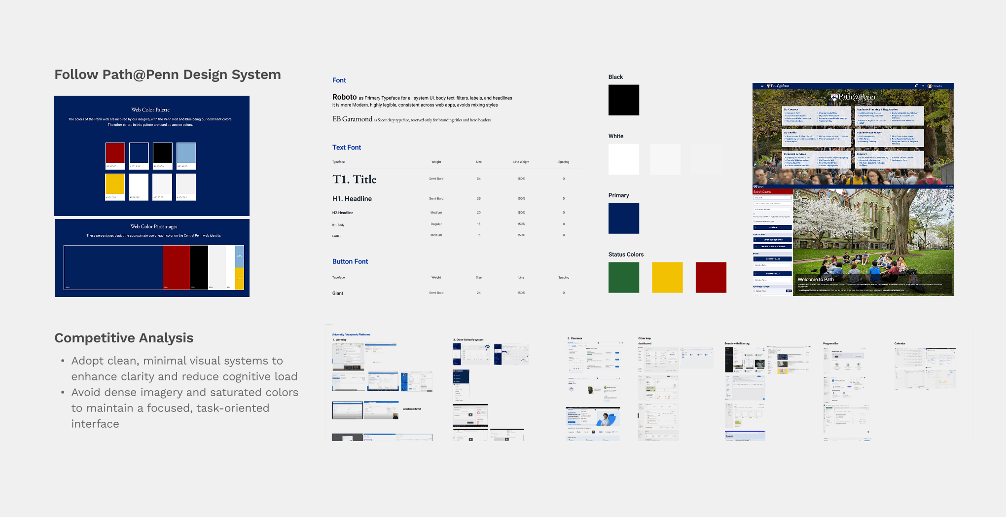
Using Competitive Analysis to Establish Design Principles

Competitive Analysis

Design Benchmarking

UX Strategy

Analyzed modern educational and enterprise platforms to identify patterns for reducing cognitive load, improving discoverability, and creating more transparent workflows. The findings informed the visual hierarchy and structural direction of the redesign.

Prioritizing Features Through Impact and Feasibility

Prioritization Matrix

Design Strategy

Wireframing

Mapped potential opportunities against user needs and implementation effort to prioritize high-impact features. This process led to four core solutions: dashboard redesign, course information optimization, calendar-integrated registration, and permission tracking.

Iterating the Experience Through Usability Testing

Usability Testing

Iteration

Interaction Design

Conducted task-based usability testing with 12 Penn students using a simulated registration flow. Feedback highlighted issues around navigation, course discovery, and enrollment clarity, leading to iterations on dashboard structure, filter placement, information hierarchy, and permission-tracking workflows.

Learning & reflection

Good information architecture is often more important than adding new features.

  • Typography, spacing, and visual hierarchy directly impact readability and user confidence.

  • Organizing information around user priorities often creates more value than adding new features.

  • Applying principles such as proximity, accessibility, and consistency helped reduce cognitive load throughout the registration flow.